COLOR UP YOUR LIFE!
5. December 2016
PAINT IT BLACK?
… No colors anymore, I want them to turn black… If you go with this Stones’ message we recommend the wall color “4320E noir d’ivoire” (evolved by the famous Mr. Le Corbusier). It’s a kind of warm and at the same time very dark black – covering everything permanently, for example the red door mentioned in the famous song. If you are a bit more of a positive thinker, this article is for you. It’s about the old story of what color suits which room and what about these stylish accents? As you might know, colors have a huge impact on our psyche and our spatial perception. So we can easily get into a better mood by bringing the right color to our rooms and moreover it affects the perception of the room’s size and the other way round – for example by keeping it more depressing and smaller with 4320E noir d’ivoire as mentioned above. This little paint job is one small step for man, a big step for your room. Very important is, not only to use the right color for you needs, but also to choose a good quality. We know you definitely do not want to have something non-natural on the walls that surround you, so the indoor environment deteriorates and open molds floodgates. Therefore, the right color for indoor paint consists of organic material, is breathable and environmentally friendly. At our flagship store in Munich, KARE Kraftwerk, we sell the high-end“Porsche” of wall colors – the poLyChro from KEIM.
A couple of examples of eco-friendly paint you can find in Cyprus are Dulux and Vivechrom.
Living Room
In the home of most of the people the real life is happening in the living room. Even more since there is the trend to a living-dining area. The interpretation of the living room in style and function is as individual as the inhabitants themselves. Sometimes the furnishing is highly representative and the highlight of the home. Often the living room has the part of a home cinema with a large TV set and a perfect sound system. According to the statistics the living room is mostly a lively place to meet and an oasis of relaxation. Family, friends and guests get comfortable with us on the sofa and we enjoy the pleasant feeling of being at home.
Do you recognize yourself? Is your living room this room where you can chill yourself on your sofa and just feel happy, being at home? Or do you always recognize some things you’d like to change? Are you missing the right grain of security to have the perfect feel-good atmosphere? Then, at the latest, it’s time for a change, since living should be joy. Where else, then in the own four walls, do you recharge your batteries from your daily hectic.
Before hasty changing some furniture and hoping for the feel-good atmosphere afterwards, check how you wish your future living room should look like in its entirety. This style question is the reason we offer our furniture in varied trend shows for every taste and budget. The trend shows help finding the perfect feel-good atmosphere for YOUR home. Today we present three of our trend shows and combine fitting colour ranges for a complete stylish look in your living room.
Summerly and bright – Modern Times
You love the sun and light and get the curtains or blinds just closed in emergency? When the days get shorter all your lights are switched on, since who would like to life in the dark? You are our modern times type. Modern Times doesn’t necessarily mean high gloss or reduced design. How do you think about gorgeous, bright wood furniture, meeting your individual needs of light and radiate warmth and comfort due to the natural material?
Of course there is also a cleaner way. We’ve got fantastic mirror furniture scaling up your room size and casting light into every corner.
For thos e friends of the sun, the walls should stay bright. Who thinks about white as a colour of no alternative – you are wrong. There is also a warm or cold white. Pure white has a rejecting and numb effect, according to research. Therefore don’t go for pure white for your living room. A slight shade of yellow, red or grey gives a warm or cold accent. And why not combining different shades of white for an elegant and classy effect. You could mix up your room with a warm wool white and an also warm but a bit brighter canvas white. That doesn’t only match perfectly with bright wooden furniture but also gives you a great freedom for your choice of pictures and decoration.
Hot and thoroughly styled – Elegance
You are into fashion, trends and warm colours? Bright or dark is not as important as the haptic and the look.
Then go for our trend show Elegance. We offer exquisite furniture which became classics after being the hottest trend and will classily upgrade your home. One series out of our trend show Elegance is the 60s Cocktail collection, we combined with warm colours and really hot retro wallpapers.
For those who love patterns and ornaments, wallpaper is a dream coming true. The more expressive the pattern and ornaments, the more intensive is the impact in your living room. An ideal mix to create some quiet areas in your room is a combination of wallpaper and wall colour. Of course you can also leave the wallpapering and just go for a hot orange on your wall. An orange living room is a real highlight, also for your mood. Warmth and light is given by this colour and therefore highly recommended for rooms aligned to the north or just darker rooms.
Besides: Orange shades increase the sociability and the appetite.
Timeless and comfortable – Cozy living
Your slogan is “my home is my castle”? Why thinking about the world out there, when your home is so fantastic. You sometimes curl yourself up into a ball and just feel comfortable on your sofa enjoying peace and quiet. You will love our trend show Cozy living.
 Natural materials like wood and leather with a lot of style are a perfect base for your own little empire. A chest with fur facing, an Oxford sofa or a metal sideboard – here you’ll find those timeless furniture making your dreams come true.
So the feel-good look for your home gets complete we’ve got the matching colour tips for Cozy living. We go for green! Besides its sedative effect green provides a feeling of security and comfort. It inspires creativity and supports our regeneration. A perfect colour for the living room even so it looks noble and timeless in combination with dark wood. Our Brooklyn series is uniquely fitting into this fantastically beautiful forest green.
The more shades of blue are in your green the cooler and dressier is the effect. So if you’d like to get the stimulating effects of green, go for a deep and rich green without any blue.
Bedroom
Time to get cosy! We wake up with a smile, the sun is shining through the window and we stretch luxuriantly before crawling back under the bedclothes once more. Our gaze travels around the bedroom and lingers with pleasure on the stylish dresser, the comfortable armchair, the made-to-measure cupboard – and then of course this bed. A heavenly bed in every way. The bed of our dreams – regardless of how many stars a hotel may have, it will never touch this bed. It means that even after the most wonderful holiday, coming home is always a real pleasure. Do you now have a mental picture of your perfect bedroom? Then hold on to it! What colours do you see, what’s the style of the furniture? Your bedroom at home could soon look exactly like this – and regardless of what you see in your mind’s eye, it can all be implemented, even if the room isn’t too large. And for all those who are still looking for a little inspiration, here are some of our top favourites for a stylish bedroom.
A bedroom in brown
Don’t let the dark colour shades put you off. At first glance brown isn’t sexy and may not appear to be the right colour for the bedroom. However, we associate warm shades of brown with closeness to nature and dependability. As a result they’re especially suitable when it comes to providing distracted and restless people with a wonderful night’s sleep. Of course the right shade of brown is important – you should avoid reddish shades of brown, and the colouring of the furniture should also range simply between beige and black. This will enable you to create a calm and stylish overall picture. We opted for a seriously dark shade of brown on the wall, combined with a fabulous upholstered bed in contrasting beige. Distinctive touches and a feeling of lightness are created by huge pictures which are simply leaned against the wall – you don’t have to hang everything up – and a vintage serving trolley which has been given a new role as a bedside table.
KARE Bed City Spirit 160×200 cm
A bedroom in natural white and apricot
Natural white and apricot aren’t really new colours for the bedroom – in fact they are absolute classics. Because they are light, warm and friendly they have a positive effect on our mood. In Feng Shui apricot is one of the colours associated with emotional relationships. It is believed to radiate warmth and cosiness – in other words perfect for a feel-good bedroom. The colours may not be novel, but their implementation can be entirely distinctive and stylish. With our interpretation of a light-coloured bedroom we create a dream from the thousand and one desert nights, in which colourful carpets add a restrained touch to a plain, cream-coloured upholstered bed and a stylish metal dresser.
A bedroom in blue
“Blue doesn’t have any dimensions – it’s outside of all dimensions” Yves Klein – according to Yves Klein blue is the only colour which has no dimensions. We associate the sky and the sea with blue – two elements which seem endless and eternal to us. For Yves Klein this makes blue a unique colour, and there’s no doubt that it has a distinctive effect on us. In addition to having a cool charisma, blue also represents harmony and calm – ideal for a bedroom. We recommend a strong shade of blue, because a light blue can often make cool and greyish impression. You can also balance out any coolness in the blue with wooden furniture. A blue wall and a fabulous wooden bed create a gorgeous atmosphere. Blue creates a feeling of spaciousness, while the wood provides the necessary warmth and gives the room a down-to-earth harmony.
Have we inspired you to design your own dream bedroom? Or perhaps you can’t make up your mind because everything is fabulous? No problem. We’ll be happy to help you in word and deed. Our experts at KARE Kraftwerk have the necessary know-how. Whether it’s a cupboard, boxspring bed or dresser, nightstand, console table or armchair – in addition to outstanding furniture in all styles, we can also offer you perfect paints for the wall by Le Corbusier and – exclusive to KARE – boxspring beds with Designers Guild fabrics. In other words, a real all-round carefree styling package for your bedroom.
CORRIDOR
Compared to other rooms, the corridor is a place where you do not stay for a long time, which is ideal for extreme and colorful statements. How long daylight falls into the room? Is it a long, narrow and tiny room? Or a space with high walls? All kinds of these questions are important for the right color selection. For that reason we’ve selected three examples for an eye-catching entrance. All we want is so inspire you with a WOW-Effect as you open the door, no matter what shape and size the corridor is.
1. Long and narrow
The classic among the corridors. Long with multiple doors, tiny windows and just small to fill with amazing furniture which give character to the room. Light and pastel tones lose their effect quite easily. The rule is simple: “more is more”. Do not be afraid of dark and rich colors. Important for the color selection is that it is taken in agreement with the other colors in the room. With bright white lacquered doors and wooden floor, every color looks great. Especially the new trend which is green-blue shades. Colored doors, for example in a bright grey shade, look elegant in combination with a darker and in a uniform tone. Important is to keep in mind to choose a warm or cold grey, otherwise the tone in tone effect disappears and instead of elegant it would look restless. Accents to dark wall colors could be photo walls with bright frames, narrow consoles, wall lights or luminous objects. Therefore the passage should not be less than one meter and, if possible, close to hip height.

2. Small and angled
In a small and possibly angled entrance, every centimeter counts. In this case, emergency solutions or compromises may not be used. We want to be happy when we enter our home and not always think where the jacket and shoes could be parked without blocking the entire way. In addition to intelligent solutions for the wardrobe, color can also bring order to a room. For example, set the area behind the wardrobe bar as a wide strip of color. Definitely an eye catcher! The wardrobe is upgraded, and by choosing a darker hue, minor traces of jackets and shoes do not fall on the wall at all. The most consistent effect is when the wall color matches the coat rack. With our coat rack skyline, made of powder-coated steel, we recommend a dark gray paint. You can also define areas clearly. If, for example, your children argue about the small square at the entrance, you define the respective storage areas of shoes, school bags etc. with different color strips. This brings the colorful life into the corridor, it looks smart and keeping order is also fun.
3. The hall
The wish of many – a real hall as an entrance area. Generous and with an open, curving staircase to the upper floors … that sounds like Tara from “Gone with the Wind”. The entrance is usually not so huge, but a generous corridor with a staircase should be designed differently from the long, narrow corridor. The larger the entrance, the more likely windows are in this area of the house. Bright colors are very inviting and enhance the effect of daylight. If a staircase should be connected ,that should not be color-coded, simply leave the walls of the stairwell white and the others about 10 cm before the connection to these settles. This creates a beautiful and gentle transition from the hallway to the staircase. Regarding to the color selection, same rules as mentioned before: everything is possible! Powdery colors create a warm and calm atmosphere in the entrance, this choice is definitely timeless and simple and fits with extravagant furniture and living accessories.

With green or blue pastel tones you create more individuality by making the room looking fresh and light, but may also a bit cold. In combination with light furniture, the blue looks more Mediterranean and the green Spring-loaded. On the other hand, blue can also be perfectly combined with industrial design furniture, which intensifies the rather cool and rough look. Both color versions also look great with dark furniture. Here, however, we would prefer summery yellow. This is an excellent contrast and is inviting and cheerful in bright rooms.
We trully hope that you could find something for your own corridor out of our three examples. Everything is possible. If the furniture for the hall is already fixed, then it is easiest to orient yourself around them. This creates a harmonious reception area that you can look forward every day. For ambitious people, a combination of dark and light colors is an excellent way to give the room more character. Depending on the type of corridor use the light and dark colors above or below. The green tones create a beautiful tone-in-tone effect and have a particularly noble effect. In order to find the right height, you should orient on a console or chest of drawers. A must have for any corridor whether colored or white is a large mirror. So you can have the last checking look before leaving the apartment.
HOME OFFICE
We start with a rather unusual room. For some of us it`s even not really existing, it’s just a corner or niche with the size of a storage room. Got it? No it’s not the washing room or the larder – let’s focus on your home office. A place where you should feel comfortable, where you can concentrate on your work and let your creativity flow by taking a deep breath looking at your wall and feeling energized again. For your work space we recommend a brighter color, most likely YELLOW! The color yellow stimulates your spiritual energy and improves concentration, thus acts against feeling drowsy and fatigue. Yellow reminds us of the sun and allows us to activate energy reserves. Potential disadvantages are hyperactivity, greater appetite and aggression. So let’s think about it – the risk is to become a creative head with an aggressive mind and a fat body (Hulk?!). Just because you painted your home office yellow, you will lose all your buddies, your significant other and if you work as a freelancer it could even get worse (turning into this green guy is not really attracting). Then you better paint it black, although perhaps we should not paint to gloomy a picture/wall. The trick is combining yellow with white, this way you and your home office will be unbeatable, cause the effect will be calming (preventing us from becoming fat and aggressive) and refreshing (which leads to becoming creative, energized and so on). Nothing can go wrong anymore, Mr. Superman, in your little yellow/white office – if you go with this little hint: Never paint the walls to the ceiling, for the ideal color design in your room. Leave some space on the top, we recommend around 10cm. That will elevate your room. Especially in your home office not all walls should be painted. Leave some walls white (if you’re feeling overly excited, just rest your eyes on the white wall). Therefore we recommend a warm, bright yellow color.
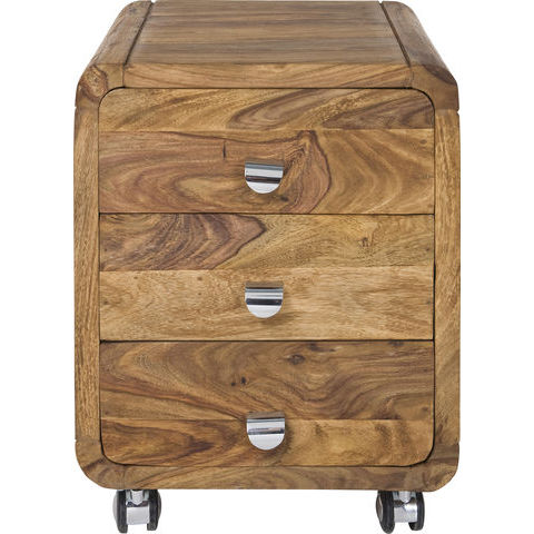
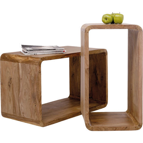
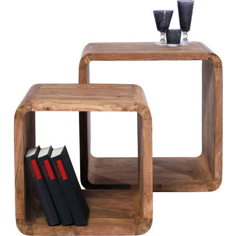
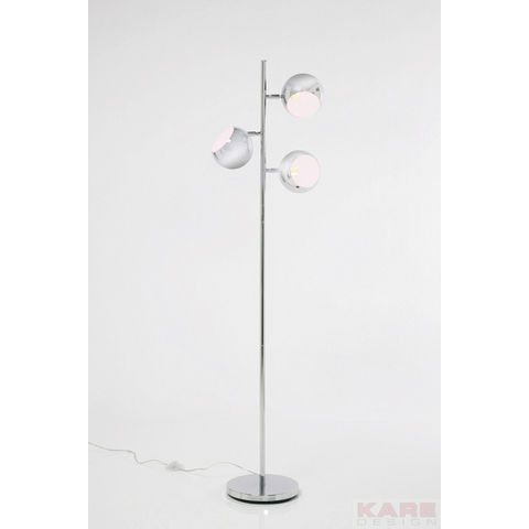
Here you can you get an idea of your new home Office:

1. Authentico Cuben Square 2- Set | 2. Authentico Cuben Rectangular 2-Set | 3. Authentico Club Roll Container 3 drawers |4. Authentico Club Schreibtisch 150×70 |5. Floor Lamp Calotta Chrome
For those who do not want to grab a brush and paint buckets, with the right furniture and accessories, you can of course also have positive energy of the “right” color to your room.


