
Experience a new level of lifestyle with KARE Magazine's latest edition! Discover expertly curated eco-sustainable design pieces, captivating new trends, and enchanting collections to enhance your living space. Our magazine is dedicated to furnishing enthusiasts with an eye for detail, providing exciting ideas to delight your senses. So upgrade your home and your values with KARE Magazine 2024.
COLOUR TREND VERY PERI
15. February 2022

EXPLORING VERY PERI: PANTONE’S COLOUR OF THE YEAR 2022
The new trend colour for 2022 is called Very Peri! Every year, the Pantone Colour Institute chooses the trend tone and this time the soft purple nuance came out. The dynamic peri(winkle) blue hue with a vivifying violet red undertone brings a breath of fresh air into your home. We have loved this colour for years and now we are taking the opportunity to share some of our favourite “peri” rooms with you.

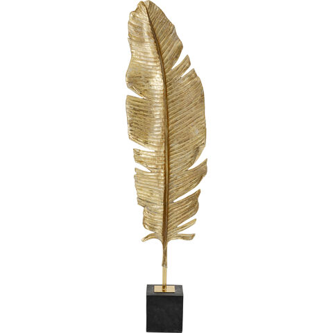
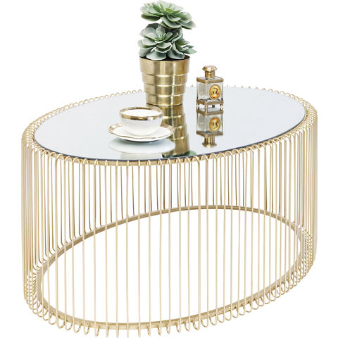
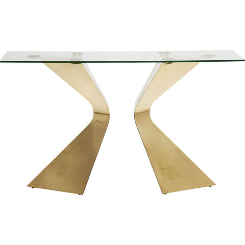
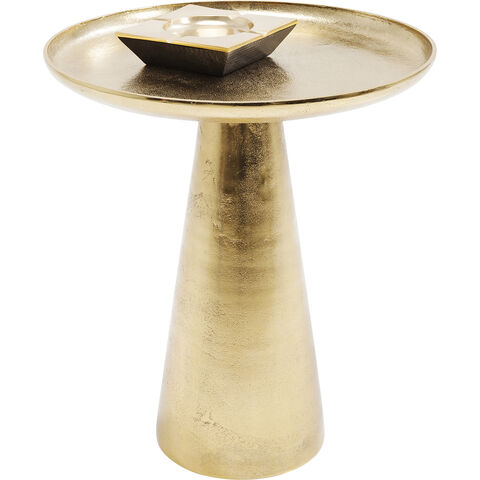
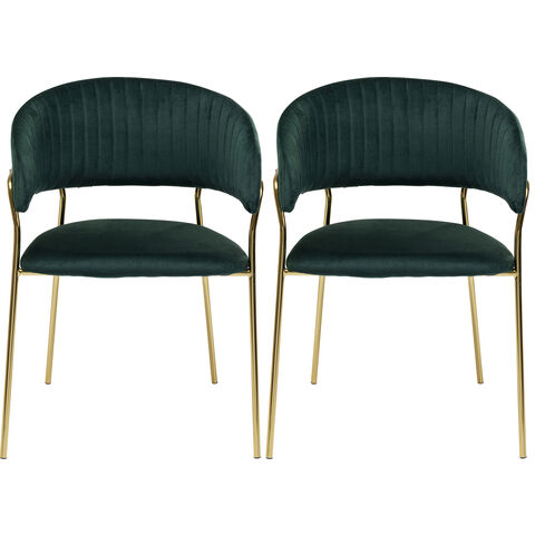
VERY PERI X GOLD

Very peri is a complicated shade, so what colours can you pair it with? Neutrals and dark shades, even super bold colours like gold will look amazing with it!
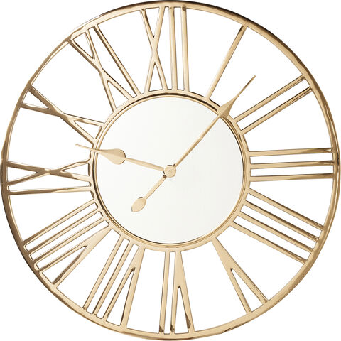
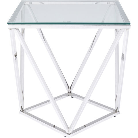
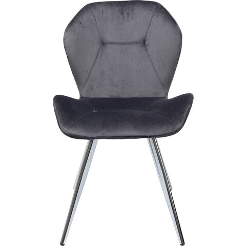
VERY PERI X SILVER

Silver and mirroring colours are great in combination with Very Peri. The bright colours provide a strong contrast and bring more openness to your home.
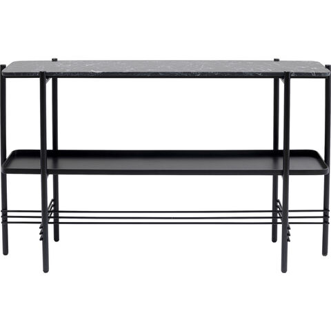
VERY PERI X DARK COLOURS

Dark tones can also be combined well with the new trend colour for 2022. They stand out from the light Very Peri colour and bring a mysterious, but also very noble atmosphere to your room.

The KARE brand symbolizes furnishing ideas which are unique, non-conformist and authentic. Ever since 1981 the company has been surprising its fans worldwide with an incomparable and inexhaustible variety of new furniture, lighting and furnishing accessories, all expressing an intense passion for design.