Upgrade your home – with the trend colour of 2020
20. January 2020

It evokes the endless vastness of the evening sky, has a pleasantly calming and reassuring effect and inspires us with its simple elegance: “Classic Blue”, recently chosen by the Pantone Color Institute as the new trend colour of the year.
We reveal how you can create wonderful effects in your home with this harmonious shade of blue. Ready to be inspired?
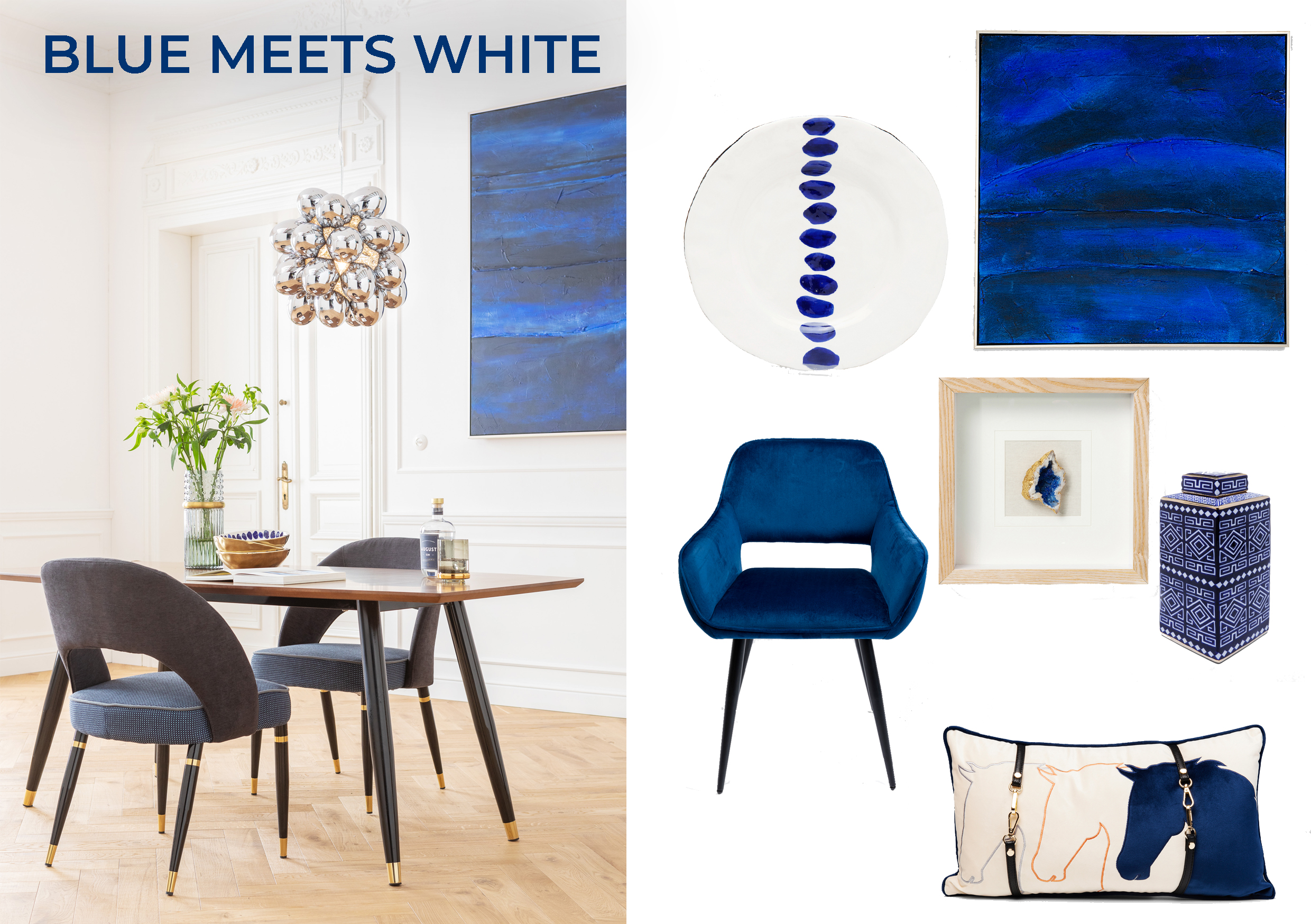
Good vibes only! Blue and white is a timelessly beautiful and harmonious colour combination that radiates maritime lightness and transforms your home into a place of relaxation and tranquillity. Perfect if you love things elegant and simple, but still want a few striking colour highlights in the mix.
How it’s done: white provides a strong contrast to any deep shade of blue, so “Classic Blue” will be particularly striking here. Unadorned rooms with white walls, for example, provide the perfect canvas for pictures in this intense blue. In addition, the maritime look can also be conjured up wonderfully with a few accessories such as decorative jars or cushions. A top tip: don’t use more than two or three colour accents per room, otherwise it will quickly look overloaded. Silver or gold-coloured details also suit this style of furnishing very nicely, by the way.
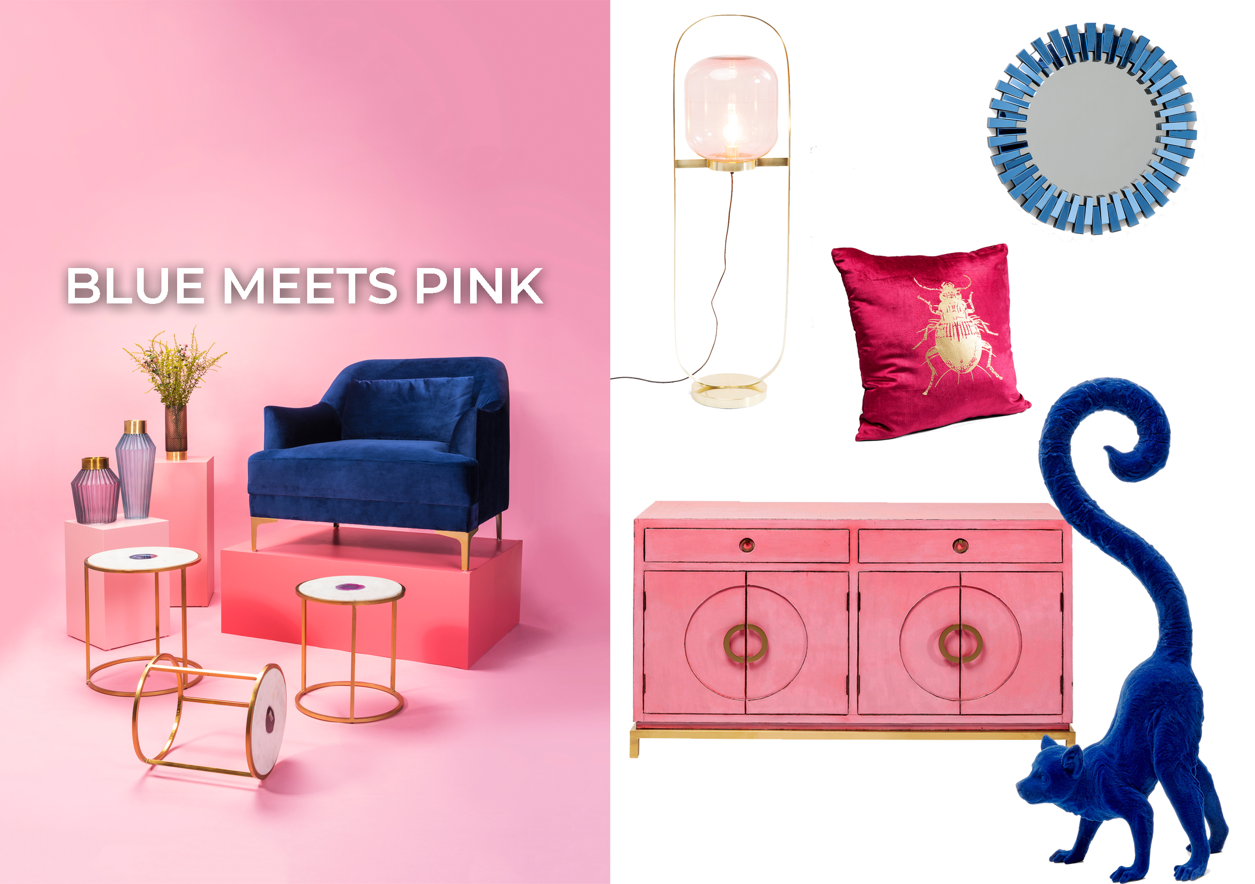
Feel like a bold combination that will really catch the eye? Then blue and pink is just the right thing for you. The contrast between these intense colours may be very strong, but it creates a stylish, exciting colour-blocking look.
How it’s done: you can spectacularly showcase decorative articles and pieces of furniture in “Classic Blue”, for example against a bright pink or rose-coloured wall. And if you don’t want to live with an all-over pink look right away, you can opt for a harmonious mix of a few products in blue and pink instead. For example, a pink chest of drawers with a witty animal sculpture, or a pink cushion on a blue velvet sofa. This furnishing trend is rounded off charmingly with elegant gold highlights. In general, here too the rule is: less is more!
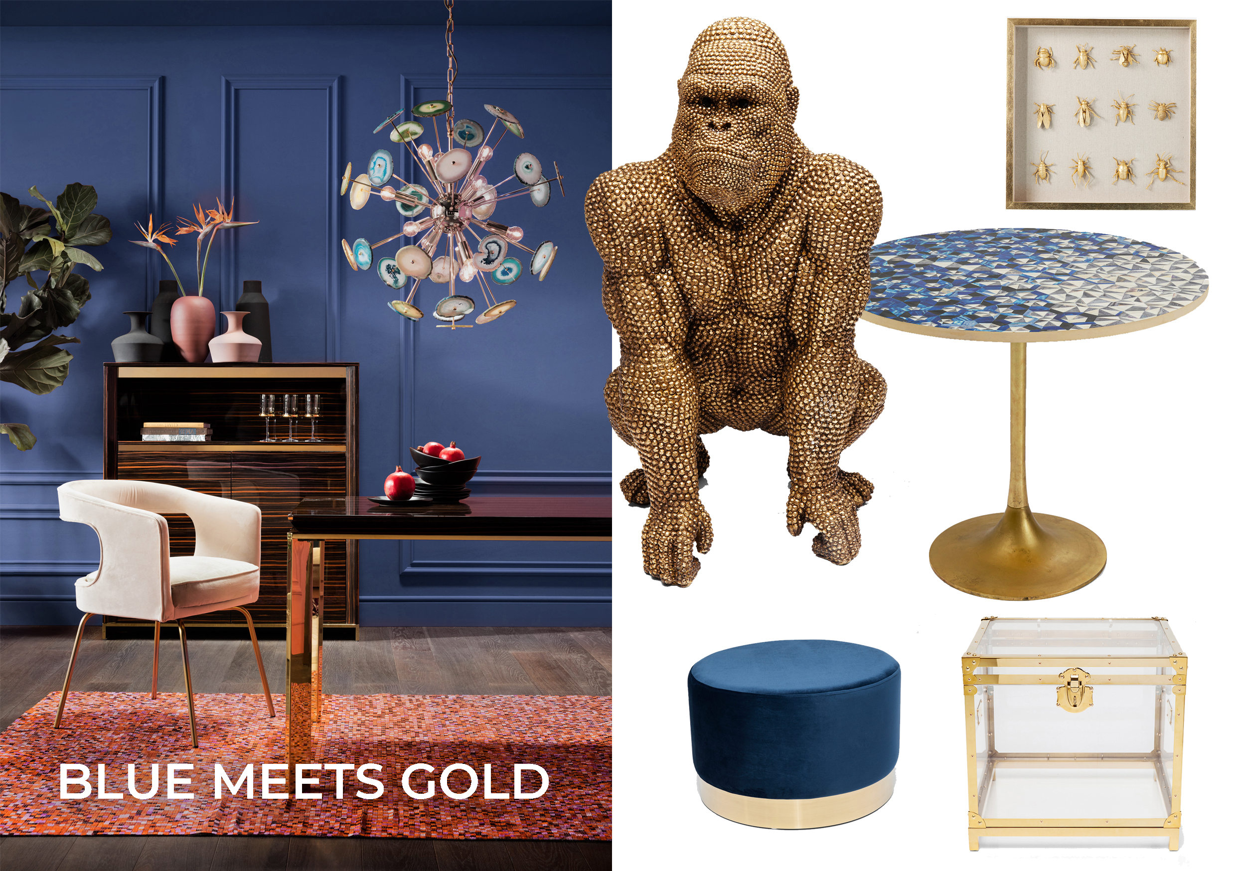
For a glamour upgrade in your home! If you’re a fan of flamboyant and luxurious interiors, this blue and gold colour combination is the perfect choice for you. Blue stands for serenity, clarity and freedom, while gold radiates opulence, exuberance and warmth – an exciting mix with guaranteed eye-catching appeal!
How it’s done: painting the wall in “Classic Blue” and adding a few golden or gold and blue eye-catchers is a great idea if you’re the bold type and enjoy trying something new. You can stage the trend look a little more discreetly with a few individual pieces – for example cool stools or tables in this colour combination. Cleverly styled and with a focus on 2-3 highlights per room, blue and gold gives your home a cosy, atmospheric and stylish ambience.
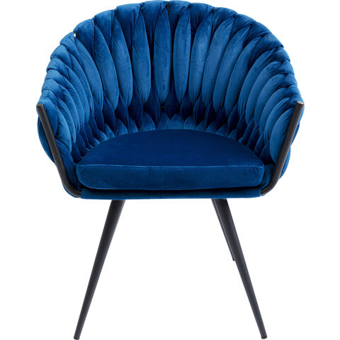
Further highlights in “Classic Blue”: